High-Impact Visual Storytelling for Recruitment: Bringing HR Data To Life, Part 1
This blog post series will help you use the right visual storytelling approach, to make your data memorable and shape decision-making about your people.
Editor’s note: Cold, hard numbers about critical workforce trends can seem theoretical. But these numbers represent real life situations: whether it’s people exiting the company to seek opportunities elsewhere, or candidates turning down job offers because the head office is nowhere near a hip urban city center. This blog post series by Visier’s UX team will help you use the right visual storytelling approach to make your HR data memorable and shape day-to-day decision-making about your people.
If you are a recruiter or HR business partner, there’s a good chance you’ve encountered the misperception that the labor market is like a supermarket: you walk in, scan the many qualified candidates on the shelves, and pick the one you like the best. Reality, of course, is typically very different. Landing the right talent at the right time and at the right price, especially when labor markets are tightening and time-to-fill is at an all-time high, is a complex, challenging, and costly undertaking.

Which recruiting lead sources bring in the most accepted offers?
Which bring in the most top performers?
Where are the current bottlenecks in the recruitment process?
Which organizations lose their selected candidate the most?
Is a signing bonus justified?
These are just a few of the questions you can use data to answer to help improve your recruiting effectiveness. But in order to truly understand what the data is telling you, and to get buy-in from your stakeholders, consider how you visualize the information.
The first step? Ask the right question
Let’s say your company is focusing on innovating new products to stay ahead of the competition, and needs to expand its product development team. You need to ask several related questions, including: “Where should we invest in job postings?” From here, you need to gather data related to the different recruitment sources and determine how effective each source has been in the past in helping you fill positions with qualified applicants. But it’s not enough to gather the data — you need to present it effectively, or all your evidence will be met with yawns or sideways glances at smartphones under the boardroom table.
Avoid this bar chart blunder
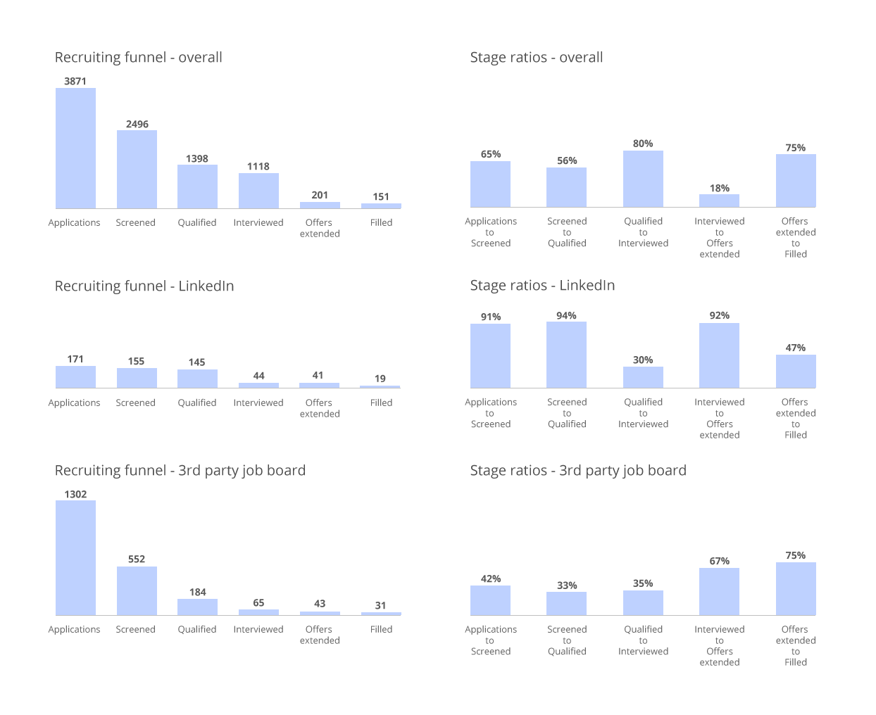
Here is an example of a visual that will miss the mark:
boring recruitment bar charts
These bar charts don’t really say much. The job boards and LinkedIn are there, but it doesn’t present the data as part of a process, so you can’t see where any bottlenecks may be happening. The numerous bar charts are bland and overwhelming. Simply put, it won’t help your audience put the numbers together so they can see where success is — or is not — happening.
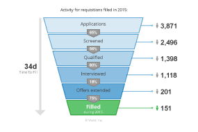
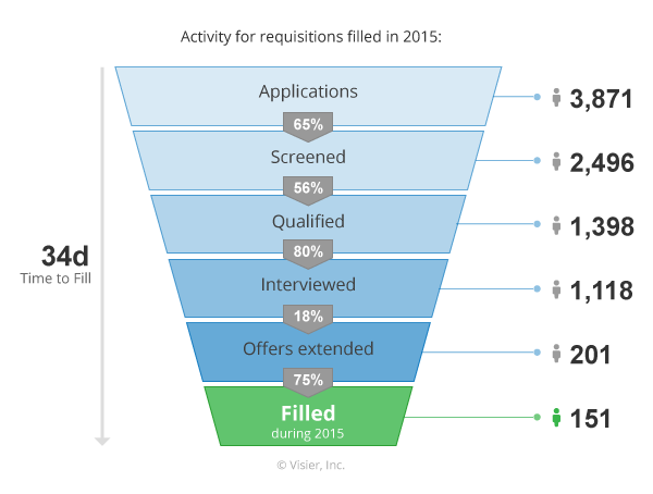
A better approach is to display the data as a funnel infographic, like this:
visier recruitment funnel
This visual is better: it helps with the mental model of how the various recruiting metrics relate. But it doesn’t immediately address the initial question, nor does it help you visualize the patterns in the data.
Let the visual do the talking
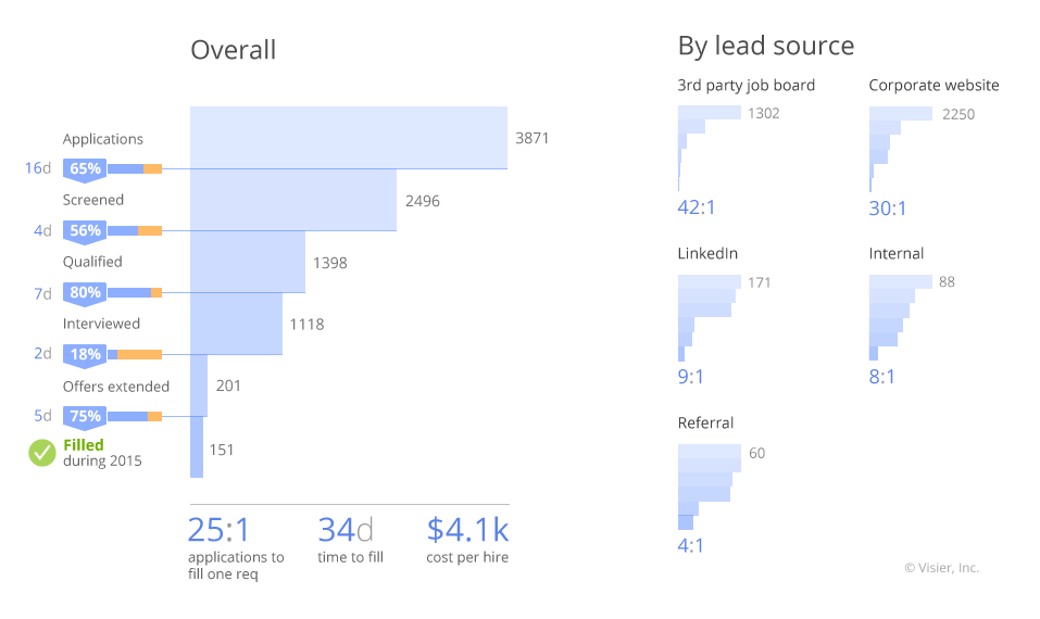
To help your audience immediately understand how each recruiting source is performing, display the data as a dynamic visualization, in this case, the funnel:
visier recruitment funnel source
Here, it is clear where you need to refine your approach: You post to the third party job board a lot, but the ratio of filled positions to applications is really poor, the same goes for corporate website sourcing. In this scenario, your audience can see at a glance that you need to focus more on investing in LinkedIn and your referral program.
visier recruitment funnel website
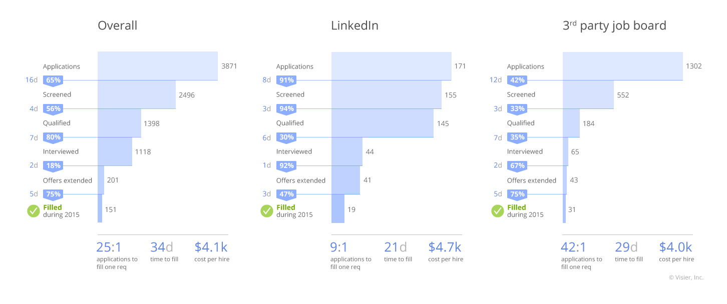
This visualization is easy to interpret, yet extremely data dense, allowing for numerous insights to be revealed. You can compare several metrics across lead sources such as time-to-fill and cost-per-hire. For example, for LinkedIn, you can see that the ratio of filled positions to applications is excellent, and the time-to-fill is relatively short; however, the cost-per-hire is a fair bit higher. You can also dig deeper into the data to see if there are any bottlenecks in the recruitment process for each source. For example, if the ratio of “filled positions” to “offers extended” is low, it may mean that your hiring managers are taking too long to extend offers. Or if the ratio of “qualified” to “screened” applications is low, the recruitment source may not be helping you tap into the right pool of candidates.
High-impact storytelling: 3 tips
When crafting a data-backed story, consider these three take-aways:
Determine what kind of story you need to tell: “If you don’t know what kind of story you want to tell, you probably won’t tell a good one,” writes analytics expert Tom Davenport in this HBR blog post
. Data-backed stories serve a variety of purposes, such as illustrating how people perceive a current issue or sharing a projection of future outcomes. Here, we are using data visualization to tell a “Why?” and “How to address the issue?” story by focusing on the root causes of not having enough quality candidates in the recruitment pipeline.
Ask the right question: In this scenario, because you have a specific question in mind, you know you need to do a side-by-side comparison of the different recruitment sources.
Make time to put yourself in your audience’s shoes: One of the tenets of good UX design is to approach the content with an understanding of your audience’s preconceptions and information gaps. For example, the arrows in the recruitment pipeline show how the process moves, which helps your audience understand that there is a flow, from applications, screened, qualified right through to filled positions.
With the right visual storytelling approach, you will help your team come to an understanding about the single version of the truth. At the end of the day, this will help you establish more credibility at all levels in your organization. When your colleagues and senior leaders go looking for the recruitment expert, they will know where to find one.
