DATA VISUALIZATION GUIDE
Maximizing HR Insights Through Effective Data Visualization
Explore how data visualization empowers your HR team. Dive into our guide to tackle data visualization effectively for HR analytics, shaping informed decisions for every use case.
Start free trialTable of contents
What is data visualization?15 types of data visualizationBest practices for getting started with HR data visualizationLeveraging advanced data visualization in HR technologyUsing Visier for data visualizationA recap on the impact of data visualizations in HR analyticsYou can’t do much with raw data. That’s why the analytics platform you’re using should help you tell a story.
Effective visual storytelling is essential in every analytical context. It involves delving into intricate data, pinpointing patterns, extracting valuable insights, and ultimately presenting conclusions to users.
In the end, every person on your team should be able to write a narrative based on the insights they’re pulling from a visual data representation. But before all else, you should understand how your team uses data to best present them.
Data visualization helps you best present data points in a way your team can understand and apply them. Use this post as a comprehensive guide for leveraging data visualization in HR analytics effectively and guiding your next decision-making process.
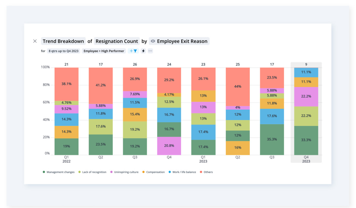
Trend breakdown chart showing resignation count of high performing employees by exit reason
What is data visualization?
Data visualization is the representation of data points through visual elements such as charts, tables, graphs, funnels, maps, and infographics in a clear, understandable, and even interactive format.
When it comes to the types of data visualization, it’s important to understand there are two distinct categories these fall under depending on the stage they’re used at:
Exploratory visualization: Refers to the use of visual representations and graphical tools to explore and analyze data in its initial stage. It involves creating visualizations without having a predefined hypothesis or specific expectation in mind. This lets you discover patterns, relationships, or insights that might not be immediately apparent in the data.
Explanatory visualization: It involves creating visual data representations to communicate a predefined message or illustrate particular findings. Unlike exploratory visualization, which is more open-ended and aimed at discovering new patterns, explanatory visualization is focused on presenting a clear narrative using a set of visual elements.
Both types of data visualization have their place in your HR tech stack. For instance, data exploration can help you identify trends or patterns within your workforce, while tools that rely on explanatory visualization can help you better interpret the data you have.

Data visualization in people analytics
When it comes to people analytics though, exploring (or explaining) data isn’t just about presenting it. Tracking career paths, analyzing one’s progression of leadership, or observing the evolution of departments across time requires in-depth analysis and understanding.
Human-related data can be complex, involving various factors such as demographics, performance metrics, engagement levels, and more. Visualizations simplify this complexity, making it easier to comprehend trends, correlations, and patterns within the data.
This accessibility enhances the HR decision-making process. Better data understanding empowers HR teams to base their decisions on concrete data-backed evidence rather than gut feelings or assumptions.
Visuals are also a compelling communication tool if you’re looking to better engage your stakeholders. HR data visualization helps in conveying insights and findings more effectively, facilitating discussion points, helping you get buy-in, and aligning everyone on future initiatives.

15 types of data visualization
If you’re handling a lot of data, you need access to the right data visualization types for the job. This way, you’ll offer various options to display data depending on what makes the most sense for your HR department and organization stakeholders.
Next are 15 different types of HR data visualization to consider. Note you’ll find all of them and more in Visier.
1. Breakdown
A Breakdown visual presents a comparison of a particular measure among multiple groups through a horizontal bar chart. It showcases the groups being compared along a vertical axis, while the horizontal axis represents a scale of values.
This type of chart is best used to compare numerical counts, frequencies, or other metrics across two or more associated groups. For instance, you can use it to analyze turnover rates and identify potential retention challenges within your company.
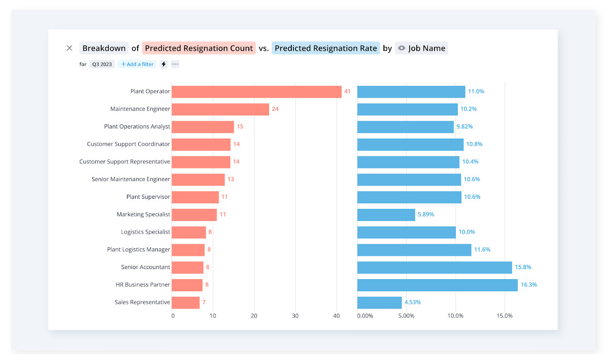
Breakdown chart showing an organization's predicted resignation count vs. the predicted resignation rate
2. Table
A table lets you see extensive data in an easily navigable layout for faster pattern recognition and insight discovery. It’s one of the most versatile types of data visualization with use cases like comparing different metrics or summarizing relevant data by employing filtering, sorting, and grouping.

Data table showing essential skills and optional skills by job name
3. Movement Breakdown
The Movement Breakdown visual illustrates the impact of both positive and negative values on a metric, such as your headcount. This visualization dissects the metric into its distinct components, showcasing their respective contributions toward the overall net change in the metric value.
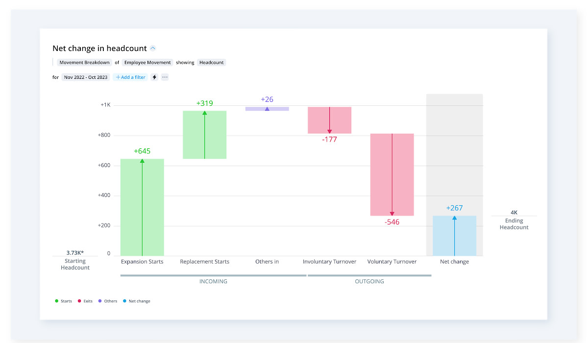
Movement breakdown chart showing employee movement of headcount
4. Movement Summary
A Movement Summary illustrates the changes that have occurred within a particular group or population during a chosen timeframe. For example, you can monitor:
How the number of new hires within a certain department compares to the number of exits
What moves happened within specific departments or units
If specific changes impacted a move
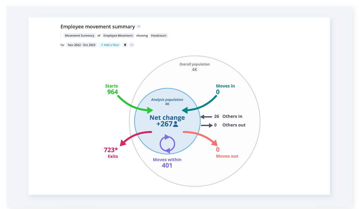
Movement summary chart showing headcount and employee movement.
5. Quadrant
Quadrants are perfect for conducting a four-quadrant analysis. You can assign quadrants to observe where certain individuals or groups can be categorized according to four distinct categories (as part of the four-quadrant analysis), discover shared attributes among groups, and spot outliers within the dataset.

A quadrant showing resignation data against compa ratios
6. Pipeline Diversity
Need a way to assess the outcomes of candidates who concluded the interview phase within a specific timeframe? The Pipeline Diversity visual aims to compare the success rates between diverse and non-diverse applicants. Additionally, it lets you explore the success rates of both diverse and non-diverse candidates when interviewed by a diverse interviewer.
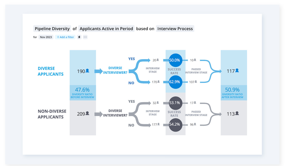
Pipeline diversity of active applicants in the interview process
7. Organization
The Organization visual presents an organization's structure/hierarchy with an in-depth look at the positions and roles within its departments.
This visual is handy if you want to get a broader perspective on the entire organization. You can do so by exploring the organization's chain of command and gaining more details into the various metrics that impact it.
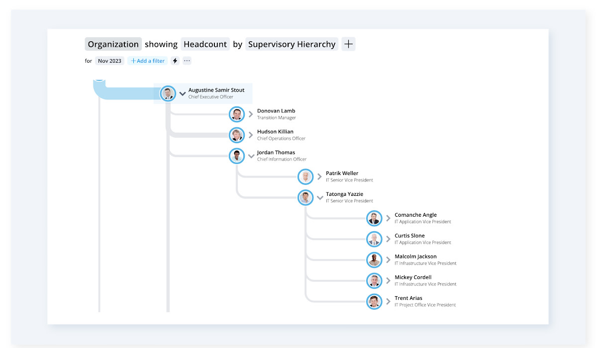
Explore the hierarchical structure of an company with the organization data visual
8. Drivers
The Drivers visual identifies the key groups within your organization that have a significant influence in either elevating or reducing a specific metric. This data visualization type helps you pinpoint the groups that will require attention if you want to generate the most substantial business impact.
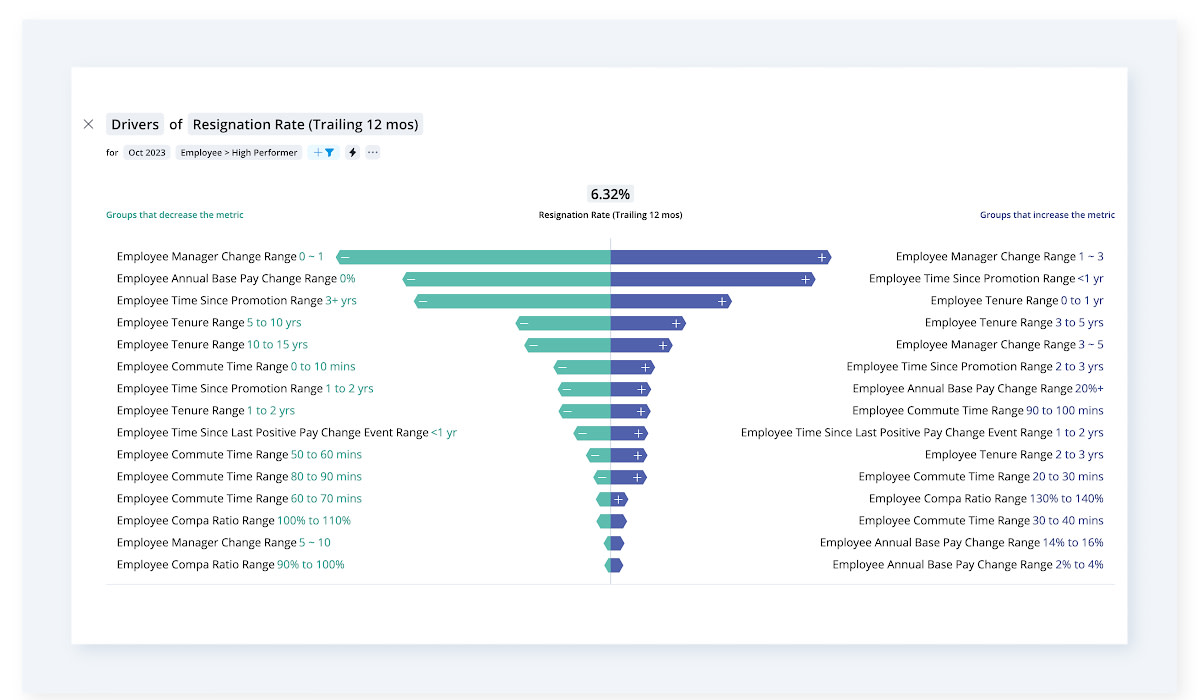
Dig into drivers of resignation rates to understand why employees exit
9. Pipeline Funnel
The Pipeline Funnel visual depicts the number of subject members who have reached or progressed through various stages of a process. These subject members can include individuals (like new hires part of an onboarding process) or entities (such as onboarding checklists).

Pipeline funnel chart showing where active applicants are in the hiring funnel
10. Pipeline Flow
The Pipeline Flow visual illustrates the journey of each applicant throughout the hiring process. Pick this chart to track applicants as they go through the pipeline and detect potential bottlenecks in the hiring procedure.

Pipeline flow showing where active applicants are in the interview process
11. Pipeline Trend
The Pipeline Trend visual illustrates the progression of subjects across multiple stages of a process as it evolves. Like the Pipeline Flow, the Pipeline Trend also lets you identify bottlenecks in the process but goes one step further by helping you predict when subjects will complete the process and see if they’re progressing at a pace that meets organizational objectives.

Pipeline trend chart showing active applicants in the applicant process over the last 24 months
12. Pipeline Forecast
The Pipeline Forecast lets you estimate the time required to fill open positions (with a specified confidence level). For instance, if you're looking to recruit three Front-End Engineers in Austin, the pipeline forecast can predict that these positions will likely be filled within 6 weeks or less, with a 70% probability.

This chart shows forecast for when the open campus positions will be filled
13. Sourcing Paths
If you’re trying to elevate your internal recruiting game, Sourcing Paths show your best internal candidates for vacant roles. These let you choose a specific job target and observe the predominant routes employees took to reach that position. You can also use this tool for succession planning, internal skill development, or simply to source new roles.
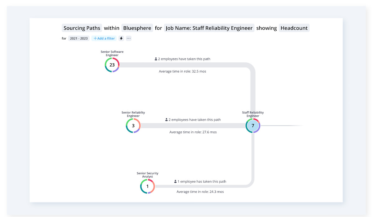
Use sourcing paths to explore the potential jobs that can be used to fill the target role
14. Career Paths
Take any role within your company and explore the various career development opportunities you have. You’ll be able to see how employees naturally move through their careers within your organization and find opportunities for them to progress to new roles.
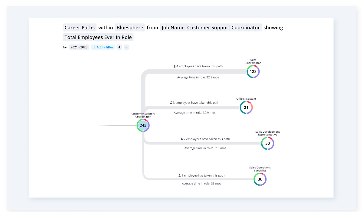
Use career paths to explore the career opportunities associated with a role
15. Collaboration Circle
A Collaboration Circle lets you quickly find collaboration activities among individuals and groups within a specified timeframe. For instance, you can see if a team member collaborates with a specific department more frequently than the average collaboration rate among individuals across the organization.

The collaboration circle chart shows how people are working together across the organization
Best practices for getting started with HR data visualization
Getting started with HR data visualization involves several key practices to ensure effective data use. We’re covering two core areas to focus on and what their implications are.
Choosing the right visualization type for your HR data
The single best prerequisite to prepare? A list of all the metrics that are relevant to your HRIT and technology leaders.
You should always choose visualizations that effectively represent these identified metrics and their relationships. A simple Table can help you identify trends and patterns while a Breakdown will be effective for looking into metrics such as your headcount, budgeted rewards, and turnover rate.
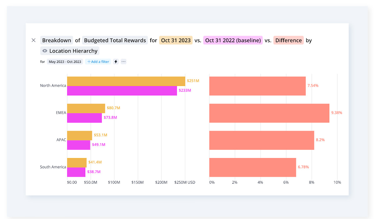
Breakdown chart showing budgeted total rewards by location and the difference YoY
When choosing your go-to HR data visualization types it’s important to also know your most common use cases. Start by determining what specific insights you want to extract from the data as well as who will be viewing and analyzing these visual data representations.
For instance, if your organization is currently heavily focused on hiring (or you’re expecting recruitment to be a big part of your future HR plans), Pipeline Trends or Forecasts are a must.

Design principles for effective data visualization
The visuals you choose should convey information clearly and accurately.
You can avoid clutter by sticking to a simple design and getting rid of unnecessary elements that would otherwise obscure or distract from the main message. To make things easier to understand, use clear labels, appropriate scales between metrics and groups, as well as consistent formatting (even when it comes to branding) to enhance readability.
Generally, you want to stick to a user-centric design. Remember that data visualization is just a part of data analysis. So the people analytics tool you’re using should support data search and filtering. A fast tool with accurate data will also enable you to easily get the information and conclusions you need without having to question the quality of the results.
Tip: Check if the people analytics tool you opted for has any extra nice-to-have functionalities like data security or data warehousing. By evaluating these, you can choose a platform that not only meets your immediate needs but also aligns with your long-term strategic goals while ensuring the security, accessibility, and utility of your data.

Leveraging advanced data visualization in HR technology
To see some of these advanced HR data visualization applications, we’re exploring three common questions you might want to find a solution to.
Are employees performing better after completing the training and applying the learned knowledge?
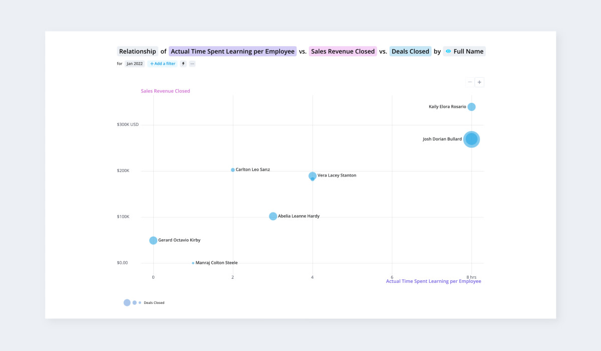
To assess the impact of your L&D initiatives, start by analyzing employee performance within specific departments that have a clear impact on business results.
The following chart illustrates the correlation between the hours dedicated to learning and the generated sales revenue for employees within the Sales department. We can see a direct connection between the time invested in skill development and the resulting sales revenue.
What career pathways have employees from a specific role taken?
Data visualization tools like Visier allow you to see who’s at most/least risk of resignation, connect key employee data sets, guide your leadership, estimate employee replacement costs, have proof-based career journey discussions, and more.
The following graph illustrates the career trajectories employees have pursued from a particular role.

Where can we leverage existing talent?
Discover how internal talent can bridge essential gaps within your organization. This allows you to leverage skills data to unearth avenues for career progression and personal growth among your current workforce.
The following example covers a biotech firm using Visier and advanced modeling tools to forecast immediate critical positions within a six-month horizon and project headcount trends over three years.

Using Visier for data visualization
Visier is purposefully built for people analytics teams to help you tackle prevalent inquiries about the workforce. Its adaptable functionalities allow customization and expansion to suit your business's unique requirements.
The platform offers over 20 diverse data visualization types (see above), along with a comprehensive collection of 2,000+ pre-built questions. These resources are readily available and adaptable to any use case, ensuring versatility and ease of implementation. Data inside Visier can be securely accessed in PowerBI, Tableau and a number of other tools using data connectors and data out APIs, allowing users who want to explore even deeper or create their own visualization can perform advanced visualizations using their preferred toolset.
With Visier People®, you can incorporate new use cases, additional data sets, metrics, workflows, and enhanced analyses. This customizable approach allows you to tailor and broaden your solution to align with your organization's evolving requirements.
Visier helps data and HRIS teams by simplifying the construction, administration, and implementation of people analytics within their current tech setup. It integrates into existing ecosystems, allowing teams to offer self-service people analytics company-wide and visualize their data for any use case they have.
Visier’s pre-existing content, analyses, and visual aids can also help you detect data entry mistakes, often referred to as "zombie data," while highlighting data gaps or inconsistencies. This enables data administrators to investigate missing values and flawed hierarchies. Additionally, it generates outlier email alerts for admins, serving as triggers to monitor sudden data changes or loading processes.

A recap on the impact of data visualizations in HR analytics
The most useful benefit of relying on proper HR data visualization remains the ability it gives you to explore data the way you want to. Users can choose their preferred variables, time frames, or demographics they want to focus on, getting a personalized exploration that helps them make better and faster decisions.
Visualizations can also simplify even the most intricate HR data, making it more understandable and accessible to a wider audience. They act as a medium for storytelling, facilitating better communication of HR insights and fostering collaboration among stakeholders across the organization.
With self-service analytics in place, you’ll also be able to reduce your team’s dependency on data specialists. This allows them to access and interpret data faster, promoting efficiency and autonomy within the team. They’ll also be able to forecast and plan for the future through predictive analytics, scenario planning, and trend analysis.
Transform your data insights into actionable strategies by exploring diverse data visualization techniques to elevate your decision-making.
Want to see how easy it is to set up self-serve people analytics at your organization? Start a 30-day free trial of Visier People®, which comes with sample data and complimentary access to email and community support to help you get up and running—fast.
